Showing posts with label COLOR INSPIRATION. Show all posts

Tuesday, February 19, 2013

From My Shelf - Marie Claire Idées


I recently went through the latest Marie Claire Idées magazine that arrived in my mailbox, and just HAD to share these lovely photo's with you! I absolutely LOVE the mixed textiles on the couch, and the gorgeous wall collage, below. My old studio used to be the color of that teal wall up above, and I really enjoyed being surrounded by such a bold color. I sure miss that!


I really enjoy the blue and green color story represented in this photo shoot, as well as the mix of patterns and textures. Although my decorating style is much different, I can definitely appreciate the eye candy! I hope these photos inspired you today!


Tuesday, January 29, 2013

Spring 2013 - Hermes

 {All images from Style.com}

I have so much more Spring/Summer 2013 runway to share with you, that I thought I'd better start, now that I've recovered from the flu. I can finally bring myself to sit at my computer and put some visual inspiration together for you!

Today I'm sharing with you Hermes. Their scarf prints are to die for. Extremely well executed, from an artists perspective. I love how they translated their scarf prints onto garments – from the hand-sketched botanicals and hand-painted tropical tree & bird print to the graphic mosaics.  I just loved the detail in these prints, and wanted to show them to you close up!

This color story of primaries and red and blue shows up again. There was a LOT of red + blue on the runway this season. Stay tuned - it'll be flooding our marketplace (even more) soon! I've also been seeing a lot of the blue + gold + gray too. I've never met a blue that I didn't like, that's for sure, and teamed up with gold and gray makes it soothingly refreshing.

Tuesday, January 15, 2013

My Word for 2013


After spending last week building out my goals for the year, budget and design calendar, I finally feel caught-up to 2013 and ready for it to continue to march to its beat. As I've been planning away, one word has been pressing on my mind and heart to be my focus for 2013...Intentional.

Intentional: Done with intention or on purpose

With 2012 being my first full year in business, I chose to ride the wave a little bit so I could be flexible enough to learn the ropes and see what types of things I would be juggling with my "new" business. As a planner type personality, it was really hard for me to do that, and to be honest, it kinda drove me crazy. Although I learned quite a bit last year, I'm excited to really focus in 2013 and be intentional. Propelling. Forward moving. Purposeful.

What's your word for yourself for 2013?

Monday, January 7, 2013

Happy New Year! 2012 Review


Happy New Year everyone! I hope you had a wonderful holiday season and that your 2013 is off to a great start! I absolutely LOVE a fresh, new year — however this year I already feel behind by a few weeks. Bummer. I'll have to catch up now or forever feel it as the months go by!

Well, I thought I'd go ahead and recap my 2012 so I can reflect on the things that I'm so thankful for as well as be able to officially close the door so I can move forward.

Overall, as I look back at 2012, it was a big year! Full of new product launches, new partnerships with companies, and for my business, it was getting the foundation laid and processes put into place to strengthen my years ahead. I also finally started to take care of myself...regularly.

So with that said, here's a review of my 2012 both in business and my personal life...

* 2102 was my first full year being self-employed! I loved every minute of it and can not tell you how thankful I am to be able to do what I get to do. So 'thank you' to all of you who make it possible.

* This was an exciting year as my artwork launched on a variety of licensed product lines including fabric, stationery, holiday cards, desk organization, personal organization, tote bags and cake! Psst...and more to come in 2013! (Which I'll be sure to share as soon as I can!)

* Throughout the year I was absolutely fortunate enough to be featured in Uppercase Magazine, Sew It All, Print & Pattern Blog, be interviewed for A Field Guide to Fabric Design by Kimberly Kight, have my licensed products featured in a handful of industry publications, be quoted in Pinterest Power, see Randy Jackson wear my print on American Idol, and even appear on a PBS TV episode with Sew It All! (Which BTW was one of the scariest, most interesting and rewarding thing to do!)

* After 5 years of owning a home out of state and being landlords, we finally were able to sell our home and move on with our lives. What a great feeling!

* I started weight lifting. Yes, you read that correctly. Me? Yep! I started this book called The New Rules of Lifting for Women: Lift Like a Man, Look Like a Goddess. I highly recommend it! I don't know that I would say that I 'look like a goddess' but I bet I can lift more than some men now! And no, my muscles aren't huge. Girls, it's good for you!


* I attended Quilt Market for the first time (psst...AND met Anna Griffin! and Amy Butler and Tula Pink and Patty Young!)

* Thankfully Quilt Market was in Kansas City, so since we lived there for 2 years (when I worked at Hallmark), we made a mini-vacation out of the trip! My husband (& his parents) came with me and we had a chance to catch up with good friends & family=a WONDERFUL and much needed trip!!

* AND Quilt Market and Surtex were back to back - eek! So I took 2 weeks off and flew from Seattle to KC, then from KC to NYC all while carrying 3 overweight suitcases (NEVER again!...wait, I think I said that last year...)! I dropped off my husband to head back home to Seattle, and took my good friend Laura with me to NYC for Surtex.

* Attended Surtex 2012 and had a blast seeing current clients as well as meeting new ones

* The first morning of Surtex 2012, we walked in to find my back wall completely on the floor and learned that we rock & handle it when things are stressful. Funny that this should show up as an accomplishment, but hey, it sure felt like one!

* Hired a lawyer to write and review my contracts

* Upon shopping, I noticed 2 different companies who knocked-off and/or stole my artwork which turned into having my lawyer send out 2 Cease & Desist letters. (The not-so-fun part of running your own business). I would tell you all about it, but my lawyer advised me not to. All I would say is be sure you Copyright your work and have a lawyer in your back pocket.

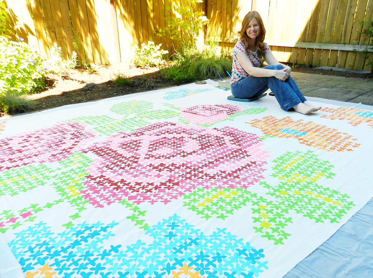
* Painted a huge 10'x10' backdrop for my Hope Chest photo shoot, and had the photo shoot at the zoo's carousel

* Opened a pop-up shop to sell my holiday cards, gift tags, and 2013 Desk Calendars

* Finally, after many years of working really, really hard and long hours in the corporate world, and always putting off what I needed to do to take care of myself, this year I finally decided to do it. I finally went to Physical Therapy (which was prescribed to me by my doctor for the past 3 years & I never did anything about it), Acupuncture and a Chiropractor. No, I'm not falling apart, but it's amazing what years of stress does to your body...& years of sitting in front of a computer! Eek!

Overall, 2012 was an amazing year. Lots of learning and lots of growing, which is a great mixture. I've already sat down and set my goals for 2013, and I can say that I'm excited. Excited to wake up every day and run my business, create new artwork, build relationships with my current clients, and meet new ones as well. Excited to add beauty and creativity to the world. Inspired to continue to learn and grow. Inspired to give, and to listen, and to allow myself to be me.

If you made it through this long, picture-less post, thank you for reading! May 2013 be wonder-filled, prosperous and insightful for you. May it stretch you in good ways and may you get better and better at becoming the best version of yourself.

Happy New Year!

-Josephine

Wednesday, December 19, 2012

Spring 2013 - Red Valentino


{All images from Style.com}

Valentino's lower priced Red Valentino line caught my eye this season too! Mostly because of the gorgeously painted backdrop they used for the photo's as well as the flirty Spring dresses. Isn't that backdrop amazing? I love the soft and dream-like colors they used in it, to paint such a tropical story. It makes it look so much more romantic and whimsical. And aren't those printed dresses and flowery necklaces beautiful? Let's just skip winter and go straight to Spring, no?!?


Monday, December 17, 2012

Spring 2013 - Dries van Noten

 {All images from Style.com}

Good Monday morning! It's pretty dark and gloomy outside, which inspired me to share the Dries van Noten runway with you today. Gorgeous, luxe fabrics mix with deep colors, and combine masculine and feminine dressing - all of which is being labeled 'grunge couture'. Don't you just love all the print mixing?!? I love how the sheer floral prints layer on top of plaid peeking through...
I always pay attention when such dark colors are used for Spring - especially when it's from such a big designer. I'm excited to see it play out in the marketplace. When I think of how this relates to paper products, I think of using vellum's, a dusting of silver or gold over prints, navy, chocolate and opalescent foils.


Wednesday, December 12, 2012

Spring 2013 - Tucker


{All images from Style.com}

Tucker is up next for sharing Spring 2013 runway inspiration. This collection is very wearable and not very over the top like so many runway shows - although I happen to LOVE over the top! The colors are fantastic in this collection, aren't they? Greens and oranges with a pop of yellow + Teal with reds and berry tones = very sell-able color palettes!


Monday, December 10, 2012

Spring 2013 - Peter Pilotto

 {All images from Style.com}

Next up on the Spring 2013 runways that I wanted to share with you is Peter Pilotto. This runway collection is digital printing at it's best! Such a visual feast! I love how they collaged so many prints together. Keep your eye out...you'll be seeing a LOT more of the blue and red color combo as I continue to share. What I like about their use of these two colors is that they infuse other quirky and unexpected colors which make it feel less Americana.

Friday, December 7, 2012

Spring 2013 - Erdem

{All images from Style.com}

I've been spending the past few weeks taking snapshots of the Spring / Summer 2013 runway's, gathering inspiration, and I thought I'd start sharing some of them with you today! Especially with Winter upon us, I though bringing you some beautiful and fresh color might just make your Friday that much cheerier!

First up, Erdem. The glowing color palette mixed with the sheer fabrics, applique flowers and lace truly make this a gorgeous collection! Wouldn't you agree? I love the accents of shiny and mirrored silver metallic shoes and sunglasses (foil on products, anyone??!) and the neon-like color treatment to traditional lace. Now THAT is how you revive traditional elements! LOVE!


Sunday, April 29, 2012

Color Love: Melon + Mint


As I was organizing my studio this weekend, I discovered some magazine tears I stashed away - and was looking everywhere for! I had just died when I saw this gorgeous photo shoot from O Magazine's March 2012 issue with Jaime King! The focus on '20s styling along with the yummy use of melon with mint (and/or chartreuse) is to die for! And I love the parasols...reminds me of how pretty they turned out in my Glam Garden photo shoot.


Along with melon and mint, add a bit of lilac and rust for a spicy, feminine look!


 One of the few times I love black mixed in. These shoes are pretty fab too!


Just thought I'd send some yummy color inspiration your way! Enjoy!

Monday, March 5, 2012

From My Shelf: Spring Print Inspiration


 {Roberto Cavali printed jacket & dress}

Happy Monday! Just had to post these print beauties from one of my spring Fashion magazines (I can't remember which one it was from! Either Elle, Bazaar or Vogue...). Super inspiring! The colors are spectacular...what I like to call 'light-brights'. This is the one time that I'm feeling the love for black - when it's used as an accent to bring out the best in other colors.

 {From left to right: Sportmax + Peter Pilotto, Versace, Prabal Gurung + Dries Van Noten, Dries Van Noten, Erdem}

Isn't this a beautiful line-up of spring prints? I just love all of the pattern mixing...and those shoes! They called this spread 'Island Life'.

{Dress=Vera Wang}

This one is gorgeous as well. I just love how digital printing makes so many things possible to wear! This photo is labeled 'Trippy' - Vera Wang took cues from Alice in Wonderland for her acid-colored, down-the-rabbit-hole psychedelics. 

 {Burberry Prorsum}

This photo is labeled 'Tribal Wave'. 

{Mary Katrantzou}

This photo is labeled 'Field of Vision'... I'm loving the names they came up for these fabulous photo's! And Speaking of Mary Katrantzou...her collaboration with Topshop is FABULOUS!! What I love about her is that she's no shrinking wildflower. She truly loves prints, and makes them over-the-top amazing!

 {Peter Pilotto}

This photo is labeled 'Water World'. What gorgeous, ethereal prints!

 {Gucci}

This photo is labeled 'The Clash'. 

Now, THIS is how you wear black and white...or at least how I would if I decided to give-in to black. It makes it much happier when it's head-to-toe print!

{From left to right: Proenza Schouler, Rodarte}

This photo is labeled 'Retro Grade'.

What an amazing magazine spread of Spring prints, yes? I haven't seen one of those for what seems like a really long time. I hope this print inspiration put a little skip in your step this Monday morning!


Monday, January 9, 2012

Spring 2012 - Burberry Prossum

 {All images from Style.comhttp://www.style.com/}

The Spring 2012 runways have come and gone, many months ago in which time I spent days scouring through them and saving off image after image of gorgeousness! I usually like to share the beauty with you closer to the season, so it stays fresher in our minds.


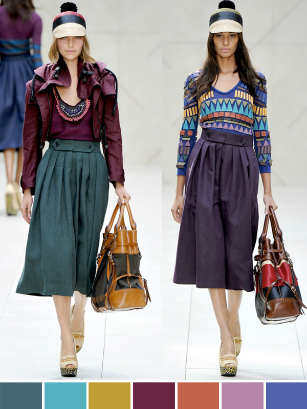
First up, Burberry Prorsum. Their show wasn't packed full of print, but the color was just awe-some! I love the deep, rich, Africa inspired colors and the rich, artisan & handcrafted feel to the collection! It's exciting to see color coming back in a BIG way! Aren't these colors DE-lish?!!


Thursday, October 6, 2011

Inspired by: BHLDN


We had a blast in San Francisco over the weekend, attending my friend's wedding. It was absolutely gorgeous! Since that day, it has definitely gotten weddings on my mind. Yes, I have been married for 10 years and already had my wedding day - but I still just love the beauty of it all! I'm such a girlie-girl, and I confess, I still buy Martha Stewart Weddings magazines for the gorgeous color & theme inspiration. LOVE!

My number one favorite store to shop at is Anthropologie. Number ONE. So, today I thought I'd share with you their wedding extension, BHLDN. They've got such wonderful, vintage-with-a-twist items, from wedding and bridesmaid dresses, shoes and jewelry all the way to festive decorations and stationery. I absolutely love the vintage take on things and all the options that allow for so much personalization and personality. It's wonderful to see weddings taking a turn from the traditional confines and becoming a reflection of the couple.


I enjoyed this info from the BHLDN story - "Our roots are with Anthropologie, so a passion for experience and creating one-of-a-kind moments runs deep. But our offering speaks more to the not-so-everyday occasions—ours is a voice that celebrates a woman’s most anticipated milestones. And one that gives tradition a twist. Be you. Be loved. BHLDN."


Isn't everything just GORGEOUS!!! I'm so glad I got married so long ago to where half of the wonderfulness that is out there now didn't even exist! Whew! But I loooove looking at it all, that's for sure! I've added these images and more to my Pinterest board 'Wedded Bliss'. Head on over there and pin any favorites to add to your boards!

Tuesday, September 27, 2011

From My Shelf: Elle Decoration · April 2011


Blues and greens are my absolute FAVORITE colors. Seriously. If I could cover my house, walls, furniture, etc. in just these colors I would be a happy girl! For many years I've wanted an aqua blue couch..or bright teal...so when I came across these tears from Elle Decoration's April 2011 issue, I just had to take the magazine home with me so I could add the tears to my inspiration library.  


I love in this magazine spread how they are taking different fabrics that revolve around a color story and piecing them together for wall hangings, table runners, mix and match pillows and upholstery.


I have a slight addiction, I must admit, to magazines. I think I may have come clean to you in a previous blog post? If not, I'm coming clean now {smile}. It's one of the things Jake and I love to go and do together - sit at Barnes and Noble, grab a stack of magazines and a coffee {ahem - a tall nonfat chai with six pumps of chai and no water - to be exact!}, and search for the best ones to take home with me. 


Just the other day I was going through my plethora of magazine inspiration tears - remember this blog post about my organization process, or this one about magazines I've had since 2002? - and thought to myself - 'Wow! I've gathered some beautiful and awesome stuff and it's just sitting in a stack!'...(because I have more inspiration tears and magazines than I have time to tear them apart and create beautiful books out of them). And with that, I thought I'd start sharing with you some of the highlights of my magazine shopping. I hope you enjoy and I hope that the pics I start sharing will inspire you to pick up that magazine at your local newsstand or start an addiction of your own! (Or maybe a slight craving to be surrounded by more beauty cause I don't want to encourage addiction {wink, wink}).


LinkWithin

Related Posts with Thumbnails