Showing posts with label TEXTILE DESIGN. Show all posts

Friday, March 1, 2013

Moyo Digital Magazine Feature - Fashion & Fabric


Issue 3 of Moyo magazine is out, which includes an interview with me talking about 'Fashion and Fabric'. In this interview I answer questions like 'How to submit your work to a fabric company', explain the differences between designing for fashion and bolt fabric, and I walk you through my thoughts and process for designing my Hope Chest fabric line.

Also included in this issue is Amy Butler who talks about the business of design, a fun designer diary from Jessica Swift, and other great pattern news and information that I'm sure you'll love. If you are a textile or surface pattern designer, I encourage you to read this issue of Moyo which is all about fabric!

If you haven't heard of Moyo magazine yet, ‘MOYO’ (pronounced mo-yor) is from the Japanese for ‘pattern’, and was started by Rachael Taylor and Beth Nicholls.

Please feel free to share this resource on your blog, in your newsletters etc and tell all your friends about it. Visit the website and scroll down for details of how to share it. MOYO is free and they want to share the wonderful world of surface pattern design with as many people as possible! 


If you read my interview and have any further questions about fashion and fabric, please post them in the comments section and I'd be happy to answer them!

Friday, August 10, 2012

Hope Chest Photo Shoot- Creating my Cross Stitch Roses Backdrop


As I'm waiting for my Hope Chest photo's I thought I'd go ahead and share with you a little 'video' I made of me painting my Cross Stitch Roses backdrop for my photo shoot. I posted on Facebook and Twitter, a little sneak peak of the backdrop, and today is the big reveal!

This backdrop I painted is based off of my new fabric "Cross Stitch Roses" which is a part of my Hope Chest fabric collection with Blend Fabrics. The 'video' is made up of photos I took while I was creating the backdrop, so you can see it being built little by little. I've never made a video before, so I'm crossing my fingers that this works. Do let me know if it doesn't (and send any tips my way) and I'll try to fix it! ; )

{Close-up of my Cross Stitch Roses painted backdrop}

I'm also including some photos of the backdrop I painted here too. I absolutely love how vibrant the colors turned out, and I can't WAIT to see the photo's from my Hope Chest photo shoot to see how it turned out there.

{Photo of my Cross Stitch Roses backdrop from my upstairs window}

I had an absolute blast creating this. It took me about 5 hours to do. I first took my 'Cross Stitch Roses' artwork, and sized one of my motifs in Illustrator so I knew what size I needed to make my stamps. To create my stamps, I cut out 'x' shapes from foam and then glued them to pieces of foam core. I then used craft paint in a variety of colors to stamp the design out onto a huge 10' x 10' cutting of muslin fabric that I laid out on my back patio (of course with a painting backdrop underneath so it wouldn't go through onto the patio!). I also used a gardeners kneeling pad for my knees in order to keep the experience from being painful.

{Me with my creation}

I hope you enjoy seeing a little part of the process and getting a glimpse into a little bit of the behind the scenes prep for my Hope Chest photo shoot. I absolutely can't wait to see the photo's and share them with you too. Hopefully in the next 2 weeks I'll have them and be able to share. Thanks so much for watching my little video! 

Friday, July 27, 2012

Sew It All TV & Magazine Feature


Last fall I got an invitation from Ellen March to be on the show Sew it All TV to talk about my fabric designing process as well as to introduce a sewing project. The sewing project I'm sharing is a cute sketchbook cover with a ribbon bookmark and full of pockets. In addition to the TV show 'Material World', Episode 302 that is currently a part of their new season 3 which is currently airing, the project is also featured in the latest issue of Sew It All magazine, out on newsstands now!

{Look for this magazine cover on newsstands!}

You can find the pattern and instructions to my fabulous sketchbook cover here.
Also, you can find the actual 7"x10" sketchbook I used here.
These are my new favorite sketchbooks as I love the thick paper and the tooth. I bought a huge 11"x14" one that I just LOOoove! But, yes, they do need to be prettied up.

{Sketchbook featured in the magazine and TV episode}
 
 
{Other sketchbook ideas...} 

The public television series Sew It All is hosted by Ellen March and is a co-production with Iowa Public Television. Each episode teaches a fundamental sewing technique and a quick-and-easy project that utilizes the technique. Whether you’re a beginner, intermediate or advanced sewist, you’ll love the casual, fun vibe and no-fear approach that Sew it All offers. For a listing of showtimes and airdates, please contact your local PBS station—and request that they carry the show (if they don’t already).

Soooo, let's back-up a little bit, and I'll give you a little behind-the-scenes glimpse into my life. When I received the invitation to appear on TV, my first response was...terror - TV? Um, no thanks! But I decided to sleep on it and see how I felt in the morning (highly recommend!). Something bubbled up that I've always allowed to guide me and that is to "do something that scares you" because I believe it's one of the key ways you invite growth into your life, and don't allow your fears to control you. And who wants to live a still, non-progressive life full of fear? So I welcomed the invitation even though I was scared out of my wits, all for the sake of growing.

I had an absolute blast doing it! Ellen is so natural at it, warm and inviting. The team there was absolutely fantastic. I just got a chance to watch the episode (Series 3, Episode 302) which was fun to see. You can also purchase previous seasons 1 & 2 on DVD here.

Let me know if you get a chance to watch the season and the episode!

Monday, April 16, 2012

Commissioned Project: Baby's First™ Dolls


In addition to my licensing business, I also take on commission work from companies and projects that I feel I would be a good fit for or a product category I'm passionate about. For the past few years I've had the pleasure of being commissioned by the Goldberger Toy company to revamp their line of Baby's First™ dolls, including a new logo, patterns for their new packaging and exclusive patterns for their doll's clothing! It's been a such fun project and I've been able to put my textile production skills to good use!

With this new product launch, we created a retro, design-focused line that will appeal to parents, grandparents, caregivers, and, of course, baby. Their new Baby's First™ website has recently launched. Look for the dolls in your local Target, Toys R Us, and the like to support a wonderful company while bringing cuddly goodness to your little one(s)!

 {A sampling of a few of the many new dolls from Baby's First™!

More about Goldberger: The Goldberger Company was founded in 1916 and is one of the oldest doll companies in America. For nearly 100 years, this family owned business has been making soft, snugly baby dolls and playthings for the youngest children, becoming the expert in creating baby dolls for children ages 0-3. By listening to its customers and responding to their needs and concerns, The Goldberger Co. continues to create dolls and accessories that are safe, well made, creative, and well-priced. Goldberger dolls are designed to delight children and those who shop for them.

What I love about these dolls is how each of them has a concept behind them and I especially love the fresh and modern colors that make them stand out from a sea of baby pink and baby blue!

Friday, January 27, 2012

Book Review (& Press!) - A Field Guide to Fabric Design


I just received my copy of 'A Field Guide to Fabric Design' by Kimberly Kight of the fabulous fabric blog True Up, in the mail yesterday, and let me just say it - I LOVE it! Kim did such an amazing job with this book and if you are someone interested in creating your own fabric collection, learning from current fabric designers or wanting to learn how to put your artwork into repeat, either by hand or in the computer - this is the book for you. She also included Designer Roundtables where she holds Q and A with a variety of fabric designers, which I am so excited to be a part of.


I'm super-sure you've heard of Kim and her True Up blog - but to let you know a little bit about Kim, she started her blog in 2008 because of her obsession with fabric, and over that time has used that passion to teach herself fabric design, and now teaches on the subject where she lives in Austin, Texas.

A Field Guide to Fabric Design walks you through how to design, print and sell your own fabric and covers both traditional and digital techniques. I love that she teaches one of my favorite Illustrator tools, the 'Recolor Artwork' tool which allows you to create colorways easily of your designs. As well as the Photoshop 'Offset Filter' which helps you create seamless repeats.


The book is broken down into three sections with multiple chapters within each section, which are:

Section One: Design and Color
Fabric Design Fundamentals
Step-by-Step Design - Covers creating repeats by hand and by computer
Know Your Color - Creating color palettes and colorways
Colorways and Collections - Creating collections of patterns for the fabric industry and balancing color throughout

Section Two: Printing
Know Your Surface: Fabric Basics
Step-by-Step Hand Printing
Digital Printing

Section Three: The World of Fabric Design
Designing for Fun and Profit

There's also a wide variety of page previews of the insides of this book on Amazon, if you'd like to see more. Overall, if you haven't added this book to your library, I would highly recommend it! Kim did such a great and thorough job at including everything you need to know about being a designer in the industry and taking a shot at it yourself. (And by the way - this book is ranked #2 on Amazon's Textile and Costumes Bestseller List - for good reason! Way to go Kim!)

Friday, January 13, 2012

Spring 2012 - D&G

 {Images from Style.com}

The next Spring 2012 runway show that I absolutely love is the print saturated D&G collection. To me, what's better than one print? Two! Three!...FIVE! The more the merrier in my book. These designs are just stunning and full of colorful scarf prints which contain a mixture of medallions, butterflies, polka dots, crests, flowers...you name it - throw it into the pot! All in vibrant, gorgeous color. Yum!


I would happily take one of those maxi dresses and add it to my closet. And check out the scarf wrapped shoes! Too bad snow is in the forecast for Seattle, cause this show makes me ready for Spring!


Thursday, November 3, 2011

Book Review (& Press!): Mastering the Art of Fabric Printing and Design


The highly anticipated book by fabric designer Laurie Wisbrun 'Mastering the Art of Fabric Printing and Design' is Laurie's first book and is an inspirational and practical guide that walks readers through the entire fabric design and printing process. Laurie finds the offbeat beauty in everyday objects and patterns, and translates them into unique surface and textile designs. Be sure to head over to her website to check out her fun & bold work!

This book is currently available in the UK and will be arriving in the US in February! I happily received my copy, read through it immediately, and decided I MUST share the contents with you.

This book not only contains techniques, tutorials and inspiration, but it also contains interviews of some fabulous designers out in the field now, which are very fun to read, and sprinkled throughout the book. And I must let you know that I am thankful to have been included in the designer interviews for this book! {Thanks Laurie!!} I had a great time answering her awesome questions and am super excited to be included in Chapter 2 'Sourcing Inspiration'.


To start things off, I must say that this book is very relevant to the now. It seems like every corner I turn I come across someone who has questions about creating a fabric collection, how to put artwork into repeat, or how to make a profession out of being a surface designer. This book is a great resource geared toward the beginning and budding designer, to assist in guiding you through the exciting field of fabric design and production.


Here's the chapter breakdowns for you:

CHAPTER 1: Designing for Fabric
Walks you through the different types of 'motifs' (such as florals, geometrics and ethnic designs), types of repeats, and working with color.

CHAPTER 2: Sourcing Inspiration
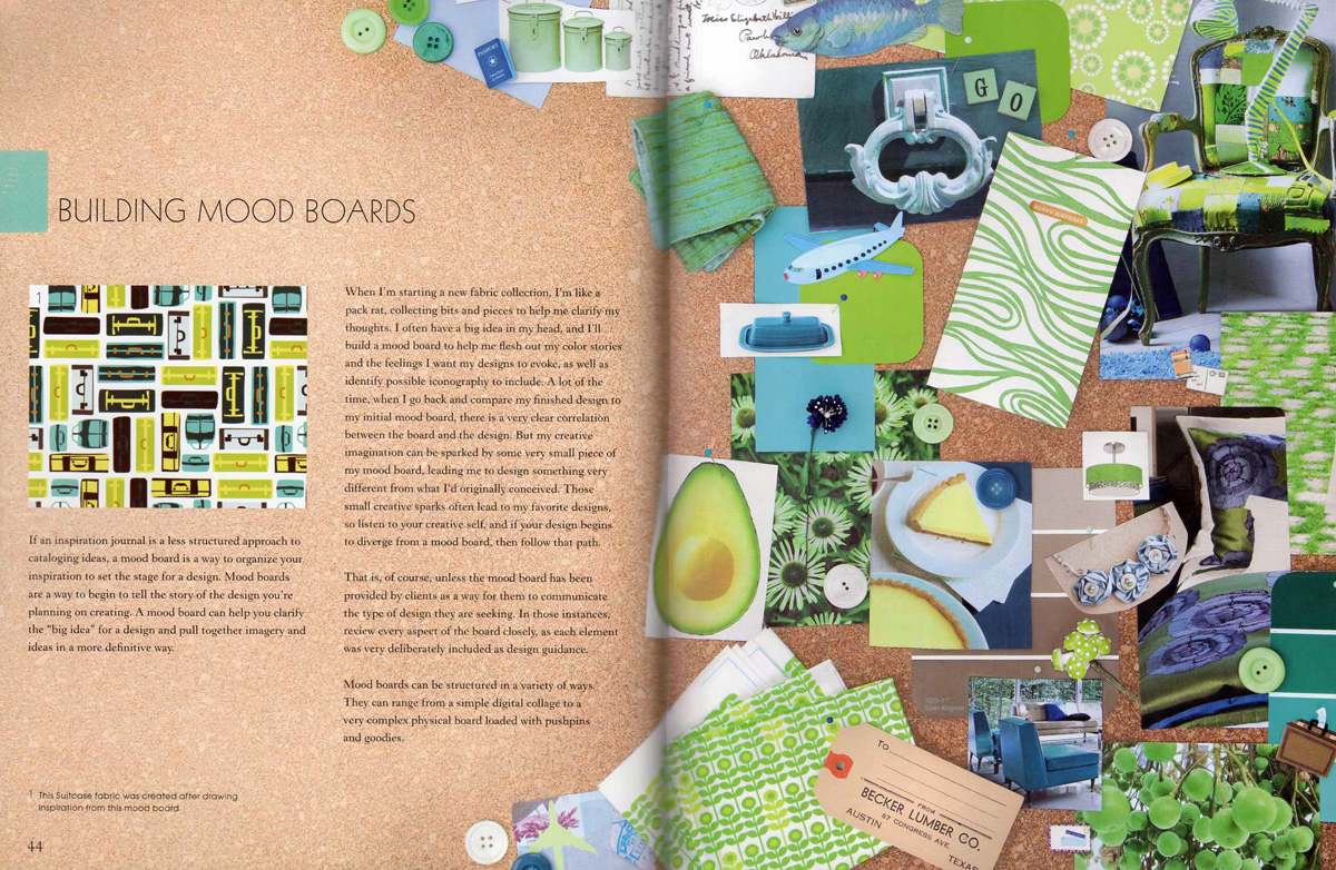
From researching trends, to keeping inspiration journals and creating mood boards, this chapter will guide you though ways to keep yourself inspired.

CHAPTER 3: Designing Patterns
Contains tutorials on how to build 3 different types of repeats in Adobe Illustrator and Adobe Photoshop CS4, how to create a digital color palette, and how to create repeats by hand.

CHAPTER 4: Understanding Fabric, Inks and Dyes
Reviews different fabric treatments, textile dyes/inks/paints and resist dyeing.

CHAPTER 5: Hand Printing
Walks you through block printing basics and how to create repeats using block printing. Also includes stencil printing & the screenprinting process.

CHAPTER 6: Digital Printing
Working with a digital printing service, including adjusting color and touching up images.

CHAPTER 7: Going Professional
Chocked-full of designer interviews, and includes lists of examples of courses of study from universities that will put you on the road to this industry, as well as a list of full-time career options. Another highlight is how to approach fabric manufacturers and how to develop collections for licensees to developing a marketing plan and tidbits on trade shows. 


I would highly recommend this book for beginning designers as it is a fabulous resource tool full of important information that will help you on your way to learning more about fabric designing! Be sure to get your hands on a copy!

Sunday, January 2, 2011

Working with Pantone Color Standards - for Fabric

With some new projects that have come my way, and new clients I've been working with, I finally had a huge need to have my own Pantone library so I could communicate color choices across the globe by digital means.

It was one of those moments where I was kinda surprised that I've been doing my own thing for a few years now, and haven't needed to communicate color yet. I've been a professional in the fashion industry for over 10 years, and working with color standards is one of the tools that you just have to have - right up there with having art supplies to create with. So, after doing some online shopping around to find a good price, I finally bit the bullet and purchased a variety of Pantone books that would fit the multiple needs and product categories that I work with.

{Picture of the Pantone Fashion + Home Cotton Selector Books}
I ended up purchasing the Pantone Fashion + Home Cotton Selector for all my fabric/fashion/textile needs because I wanted to be able to remove the colors from the book and place them next to other colors to see how they work together, when choosing colors for my artwork. I would much rather have purchased the Pantone Fasion + Home Cotton Swatch Files books, but that price tag was waaay too high! However, having the ability to work with color chips individually would have been quite dreamy, as this is what I'm used to in my professional environment. I also purchased a variety of Pantone books for paper as well, which include the Solid Chips and the Process Chips.

{Picture of the inside of the Pantone Fashion + Home Cotton Selector Books}

EXPLANATION OF PANTONE & COLOR STANDARDS
For those of you who aren't familiar with color standards or Pantone, let me give you introduction to what it is, and the importance of working with color standards to communicate color accurately. First off, a 'color standard' is a standard language for accurate color communication, from designer to manufacturer to retailer to customer, across a variety of industries. Since color is seen and interpreted differently by individuals, a color standard allows for us all to communicate the same.

There are two major companies out there who produce color standards for the fashion industry. They are Pantone and Scotdic. Pantone is more globally known and used because they also produce color standards for the graphic design industry, web, plastics, etc., and because of this have become the leader in the industry. For this blog post, I'm just going to focus on Pantone.

When using a color standard, and communicating color to a manufacturer, it is important to use the correct type of color standard for the type of product you are working with because the same color will look different when printed on paper vs printed on fabric, etc. This will also allow for the color you are expecting it to look like, to actually be able to be achieved.

CHOOSING THE CORRECT PANTONE STANDARDS
Here are some examples for you regarding working with and choosing the correct Pantone book. Example 1) If you are working with textiles, you would use the Pantone Fashion + Home standards, as the standards are made out of cotton, therefore the colors are achievable on fabric. Example 2) If you are in the graphic design industry, and are printing out a 2 color brochure, you would use the Pantone Solid Chips book, and then choose between the coated and uncoated books, based on the paper your brochure will be printed on. This is because 2 colors are cheaper to print than '4 color process', which uses a mixture of the 4 ink colors 'CMYK' or Cyan, Magenta, Yellow and Black. Example 3) If you are in the graphic design industry and working on a menu that has full color photo's of the entree's as well as multiple colored graphics, then you would use the Pantone CMYK coated or uncoated books for process color, so you could achieve multiple colors using 4 color process printing.

PANTONE'S DIGITAL COLOR LIBRARIES
Also, within digital programs such as Adobe Illustrator & Photoshop, you can open up digital Pantone libraries and work with colors that way, so that the colors used in your document are able to be used as a communication tool to your manufacturer. This is how the graphic design industry works. It's a bit different in the fashion industry, and I won't go into that now, however Pantone did come out with a digital color library for Fashion + Home colors, which I did purchase but haven't used yet. I'm curious to explore this further and see how widely this becomes used in the fashion industry in the future.

Ok, are you still with me? Hopefully this is helpful and not too much information that is causing your head to spin!

WORKFLOW: FROM DESIGN TO PRODUCTION
I also wanted to chat about workflow from design to production, when working with color standards, and when working directly with a manufacturer. Let's say that you design a pattern that is going to be printed on fabric. You pull out your Pantone Fashion + Home color standard book, and begin choosing the colors you want to be used by the manufacturer in your design. You communicate to your manufacturer that the light pink in the artwork is to be Pantone 14-1419 TCX. (Always include the latter part of the number 'TCX' to make sure you and the manuf. are using the same version of Pantone books!).

If the manufacturer doesn't have the Pantone TCX standards on their end, and they only have TC (older version of Pantone colors, before TCX came out), then you have two choices. Communicate colors to them in the TC version, or purchase individual Pantone TCX standards or 'SMART color swatch cards' for each color you want to use in your print and send them to the manufacturer for them to use. If you do this, be sure to cut them in half first - one half for you to keep and the other half you send to your manufacturer, so you have a record of the color.

On a side note - another avenue to all of this is the light source or 'color evaluation tool' - you want to be sure that the light source you are reviewing color in is the same light source that your manufacturer is reviewing color in. This way your communication is very accurate. If you are looking at color under a very yellow bulb from your desk task lamp, and they are looking at color under a fluorescent light source, then the color will look very different, and you will not be communicating about color the same.

Next, the manufacturer will begin creating a strike-off, which is your artwork printed on fabric, and will send off for you to review. When you receive this, you pull out your individual Pantone standards, and compare them to the strike-off under the agreed upon light source, and make your color comments. If the color is off, then you make your color comments to your manufacturer on what they need to do to correct the color. For example, 'reduce red'. Once all of your colors have been commented on, your manufacturer will then make those color adjustments and send you another strike-off. Each strike-off is usually a 2-3 week turn-around. So, if colors aren't coming out as accurate as you would like, and your deadline for production is fast approaching, you will need to either accept a strike-off for what it is or drop it from your line if you think the coloring will not sell.

Once all your colors have been approved, your manufacturer will then begin printing 'bulk' or production yardage of your artwork!

EXPECTATIONS
If you are working with a fabric company, many times they are handling this workflow internally. Sometimes you can opt in to be a part of the approval process, in which some of this would fall onto your plate. If that is the case, then it's very important to be sure to be on top of communicating on the strike-offs ASAP so you can be sure to be a part of hitting the production timelines. It's also important to remember that getting 100% color accuracy is nearly impossible. Color standards do indeed make accuracy and communication not only possible and achievable, but there are so many factors that come into play about why a color is not able to always be achieved.

That's one case when you need to throw off your designer diva hat and throw on your business hat, partner with your fabric company/manufacturer to make the best decisions together to ensure that the product is sell-able. Remember, you are one of the only people who have seen the original artwork & color intention, and will need to look at the fabric from another angle and ask yourself "Is it still sell-able?", "Does it still look good?", "Does it still set with the other prints in the line?". If so, then you have achieved success, not perfection, but success, and that's the best we can hope for!

Ok, this was a loooong post! I know many of you come from a variety of backgrounds and have your hands in all different types of pots, so I'm not sure if this information is interesting or helpful at all, but I thought I would try to bring you some of my professional background and experience and help give you some info, for those of you who this is relevant to. Hope this helps! If you have any questions, let me know, and I will try to answer.

Of course, with all of the above, there are so many other pieces of information that I didn't go into, including monitor & printer calibration, because that would make this post never-ending, and much more of a 'class', which I opted out of : )
Sunday, March 21, 2010

My Print Inspiration & Research Process


I thought I would go ahead and share with you my print research and inspiration process! Things you've got to know about me are that I am a researcher. I live for research - well print and color research that is! It fuels me and inspires me and I love to review and collect information.

I work in the fashion industry, and for about six years my job entailed researching print and color trends, and then creating prints for our line based off of those trends. My responsibilities involved predicting trends for our product lines 8+ months out, creating color palettes for our buying team to choose from, designing color boards and print trend reports based on my findings, and then I would present this information as well as supporting prints, to our team and buying team. Ok, that's the backstory of where my obsessive researching all started! : )


With that said, I looooove books and magazines! Jake and I frequent Barnes & Noble, and with chai in hand, I sift through the new magazines that come out each month. Sometimes a few come home with me, if there is enough amazing print or color inspiration inside them!

I subscribe to a bunch of fashion magazines: Vogue, Bazaar, InStyle, Lucky, Teen Vogue, etc. and always pick up Boho mag from the newsstand as soon as it comes out. Other magazines I frequent on my trips to Barnes & Noble that usually come home with me are: Marie Claire Idees, Ideal Home, Living Etc, Do It Yourself by Better Homes and Gardens, Sew Hip, Computer Arts, Martha Stewart Living and Martha Stewart Weddings. There's a TON more magazines that catch my eye that I pick up and sift through too, but these are the ones that are always in my arm, heading to the table to peruse.


Years ago, I found myself saving whole magazines when there was juicy print inspiration inside. I would tag the pages, and then never go back to them because the following month's magazine would be out and I would be on to something new. Of course I didn't want to toss my magazine stash, knowing that there were goodies still inside! So after having to move my magazine library a few times, I finally decided - I would rip out the pages I wanted.


That was a very fun and freeing feeling! I would rip out the pages, then recycle the rest of the magazine. Suddenly my load was much much lighter! But then my stack of magazine tears started climbing high, so I started organizing them into different categories. My print inspiration categories include things such as hand-drawn florals, graphic florals, geometrics, medallions, paisleys, stripes, plaids, wallpaper prints and the like.


Well, of course I couldn't live with them in their stacks! Sifting through pages and pages of inspiration, when the inspiration would only be a small portion of the page just seemed like it wouldn't be very inspirational after all, and would take so much time to find anything.

What I end up doing is clip out the part of the page that has the inspiration piece on it that I like. I purchase a ream of white cardstock (cheap but sturdy), tape, comfortable scissors, sheet protectors and binders. I then organize my clippings on a page and group them by color, hand or print feel and tape them down.

Once a page is done, I stick it into a sheet protector and then into a binder. My binders are organized by print theme, so when I am ready to start creating a "wallpaper" print, I'll pull my inspiration (clippings, books, etc) for a reference and begin drawing away!


Mind you, I am a stickler for going off on my own and creating original artwork. I am totally against copying someone else work - that practice outrages me! I have my style and create what I like according to my style and personal interpretation. When I look at inspiration I may be inspired by the concept, such as for a wallpaper print "Oh, I like how there is an outside element that wraps around the center design, and how the outside element has a texture inside of it". Then I go off and draw my own motifs keeping in mind what inspired me, and then deviating from that path as my print develops. Inspiration is used as a starting point, and I always recommend pulling inspiration from 3-8 different sources.


I've been creating my print inspiration binders for about 5 years now, and have a few binders and a hundred plus pages full of beautiful inspiration that makes my mouth water whenever I go through them! I'm still in the process of getting my binders up to speed, as I'm tearing out more inspiration than I'm categorizing! I think my goal will be to spend time building my inspiration library once a month so I stay on top of things and don't get inundated with tears, like I am now!

I also do this process for color, and will be sharing that with you soon as well!

How do you organize your inspiration? What type of inspiration drives you? What are your favorite resources? What tricks have you found that help you keep on top of it all? I'd love to hear!!

Tuesday, October 6, 2009

Book Review: Digital Textile Design


In my last Amazon.com shipment, I purchased a few different design books. One that I would like to share with you today in this book review is called Digital Textile Design, by Melanie Bowles and Ceri Isaac. This book contains a plethora of wonderful information ranging from current and future textile industry printing techniques and technical knowledge, to a range of Photoshop and Illustrator tutorials with a focus on creating textile patterns.


This book is a must read for anyone interested in the textile industry, printing techniques and wants to learn how to put patterns into repeat in Photoshop and Illustrator. I would recommend though that you have a standard knowledge of Illustrator and Photoshop in order to follow along with the tutorials. For more experienced Textile Designers who currently work in these programs and in the industry, the tutorials will likely be things you already know. There is however so much wonderful industry information, that I found it quite engaging, and learned quite a bit, even with being in the industry for over 10 years.


The last few seasons, the runways have been overrun by unique and jaw-dropping digital prints. See the Basso & Brooke collection from the Fall/Winter 2009 runways to get a glimpse of the fascinating and amazing full garment prints that are happening. (I have also blogged about it in my previous post). Digital printing is infiltrating the fashion industry, and year after year the prices are inching down little by little so that someday, hopfully, the world can do more digital printing at a mass-market level.

Example of Basso & Brooke digital printing from the Fall/Winter 2009 runway

It's quite inspiring to see what can be achieved with digital printing, as well as types of prints and repeats, that you are not able to achieve with traditional methods of printing. Digital printing opens the door for the textile designer to a whole new world, which will allow for a lot of creative growth. I'm excited to see what happens in the industry!


For the book review, I want to give you in-depth information regarding what's inside in order to help you decide if it is the book for you. Below I have listed the tutorials included. I have also posted images of Tutorial 20 on Amazon.com, so you can read through it step by step to see how they are written. Ok, here we go!

CHAPTER 1: Textile Design and Print in the Digital Age
This chapter introduces and explains digital printing in the fashion industry.

CHAPTER 2: Digital Design Tutorials
  • Tutorial 1: Using Filters in Photoshop
  • Tutorial 2: Creating Complex Color Blends (Illustrator)
  • Tutorial 3: Building Floral Motifs ( (Illustrator)
  • Tutorial 4: Cross-stitch Effects (Illustrator)
  • Tutorial 5: Engineered Prints (Photoshop)
  • Tutorial 6: Sequin Effects (Photoshop)
  • Tutorial 7: Photomontage (Photoshop)
  • Tutorial 8: Building a Brush Palette (Photoshop)
  • Tutorial 9: Textured Effects (Photoshop)
  • Tutorial 10: Creating a Color Palette (Photoshop)
CHAPTER 3: Patterns and Repeats
  • Tutorial 11: Photoshop Basic Block Repeat
  • Tutorial 12: Photoshop Block Repeat with Offset Filter
  • Tutorial 13: Photoshop Simple Half-Drop Motif
  • Tutorial 14: Photoshop Half-Drop Repeat
  • Tutorial 15: Photoshop Gingham
  • Tutorial 16: Photoshop Creating Stripes
  • Tutorial 17: Illustrator Basic Pattern Swatch
  • Tutorial 18: Illustrator Diamond Pattern
  • Tutorial 19: Illustrator Plaid Patterns
  • Tutorial 20: Illustrator Half-Drop
CHAPTER 4: Introduction to Illustration
  • Tutorial 21: Texture-Mapping with the Pen Tool
  • Tutorial 22: Texture-Map and Line Drawing
  • Tutorial 23: Creating Graphic Silhouettes
CHAPTER 5: Digital Craft
This chapter includes information on combining digital techniques with traditional artistic methods. For example, hand painting & digital print, screen printing & digital print, foiling & flocking with digital print, digital print onto vintage fabrics, and many more. There are also Designer Profiles on Patricia Belford, Helen Amy Murray and Rebecca Earley.

CHAPTER 6: Technology for Digital Textile Printing
This chapter covers textile printing methods and technology for both traditional and digital printing. There is also a little bit of information regarding CAD software options, and how to work with color with regards to color management.

Whew! Ok, that was pretty in-depth! I hope after reading this review you are as excited about this book as I am! Enjoy!

Saturday, May 9, 2009

Some of my Product out at Nordstrom Now


Right now a lot of my product is in stores at Nordstrom. I work there for my day job and at night do the fabric thing on the side. This is almost the last of my product that will be shipping in BP (junior girl's), as I have moved to another position in the company and am not currently working on juniors clothing. Instead I get the chance to support all of the brands and do artwork on a wide variety of product lines. (Yay!) I thought I would take a minute to post some of my work here. If you're at Nordstrom shopping in BP any time soon, check out the Susina, Frenchi, Rubbish & Tildon lines, and chances are, you are looking at my work. Enjoy!

Monday, April 20, 2009

True Up Interview - Part 2

As mentioned previously, here is part 2 of Kim Kight's interview of me at True Up. This time it's about the Hot Blossom collection. She asked me about the inspiration around each pattern and color story, which was really fun to reminisce! Thanks again Kim!

That paisley sure got me (read the interview to understand what I mean). Whenever I see it, I find it humbling and those memories keep me pressing on when I feel stuck...which can be often sometimes. I'm super grateful to Robert Kaufman for picking up the Hot Blossom collection, and am really excited to see what people do with it! I think that will be the most inspiring to me - to see it come alive through another person's perspective. There's something about a creative passing something to another creative, who passes it on to another creative... like we're all collectively working on something fun together and inspiring and being inspired by each other. TAG - you're it! Be sure to upload the fun things you make to the Hot Blossom Flickr group!

Friday, April 17, 2009

True Up Interview - Part 1

A short while ago I sent Kim Kight at True Up blog a little e-mail to let her know about my Hot Blossom collection, and she splendidly suggested doing an interview - thanks so much Kim! Today she posted "part 1" of the interview...stay tuned for more on Monday. Yes, this quiet introvert really does have a lot to say - ha! I was super flattered that she would even ask, and found it really fun to chat with someone in this new industry. It was a good exercise for me to push myself to open up and share a small piece of my life.
“True Up” means to make balanced, straight, square. In sewing, “true up” means making a piece of fabric true to grain with a well-placed cut or rip. True Up is a blog devoted to fabric, and Kim Kight is a definite fabric aficionado.

It's been great chatting with Kim, and it's so inspiring to see all of her fabulous work, fabric postings, interviews and information she pours into her blog. True Up just turned one year old a few days ago (Happy Birthday!) and Kim has soared to huge heights in such a short amount of time. What an inspiration!
Thanks for all the information and inspiration Kim! Here's wishing you a fab new year!

LinkWithin

Related Posts with Thumbnails