Wednesday, August 19, 2009

Book Review: Naive - Modernism And Folklore In Contemporary Graphic Design

For those of you who know me well, you know that I am a HUGE book lover! The particular category of books that I love are those that have a focus on pattern, art, crafting, fashion illustration and design - ones that are done really well and include a plethora of inspiration. I am definitely a researcher and collector of information! Jake and I are often at Barnes & Noble and there I am perusing books and gathering my list of must haves and duds. My personal Amazon wish list is about 8 pages long - ok I think you get the point! So I thought I'd start sharing with you my book findings and give you information so you can decide if the book is right for you. Please do let me know what information would be helpful to you, and leave comments if you have any particular questions about the book. Enjoy!

The first book up is:
Naive - Modernism and Folklore in Contemporary Graphic Design.
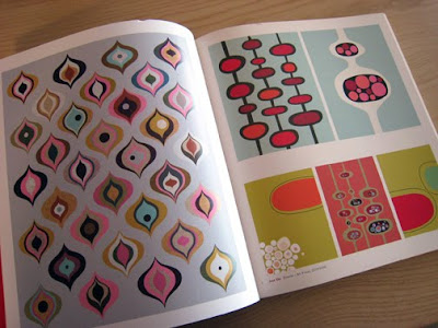
I first came across this wonderful book on one of my trips to Anthropologie, flipped through it and immediately knew it was a true gem! It's 176 pages are loaded with beautiful and contemporary illustrations ranging from textiles and stationary to poster art and book covers. The editors did an impeccable job at selecting the artwork to go into this book because every page is inspiring, vibrant and shows a variety of modern artistic techniques. The artists chosen to be represented in this book are of high caliber, and their work speaks for itself. Some of the artists represented are: Helen Dardik, Matte Stephens, Jenn Ski, Hanna Werning, Public Domain & James Gulliver Hancock. The only text in this book are captions at the bottom of each page giving credit to the artist who's work is being shown. I
highly recommend this book, as it's one of the most well done inspiration pieces I've seen in a long time.

Sunday, August 9, 2009

My New Christmas Rubber Stamp Designs at Impress Rubber Stamps


About two months ago I worked on some Christmas designs for Impress Rubber Stamps, and now they are in the stores and ready to ship! Christmas already you ask? Oh yes! This weekend I pulled out all of my old stamping supplies and went to town playing with the new images, which was a LOT of fun! After spending a few hours creating cards, I am now excited and ready for Christmas to come. I really enjoy working with my hands, and this weekend has been so refreshing to step away from my computer and create fun things while getting messy with ink and glitter. Note to self: do this more often!

Impress Rubber Stamps is a Seattle based company, and has been around since 1987. They have three retail locations in Seattle and ship their stamps all over the world. They were around before the scrapbook boom and were known for creating modern looking cards as well as using unique supplies and techniques before anyone else. Check them out, peruse their stamps and ideas pages online - and yes they DO ship directly to you, so if there are some fun doodads you must have and some pretty stamps you want to work with, you can order online. Yay!


I had the joy of working retail for Impress while I was in college, which was so much fun because I got to play with all the new stamps, supplies and papers, as well as test out new techniques in order to create cards for display. What a fun job, right? I continued working for them when I got out of college and started my career because it was such a fun experience that grew into designing artwork for their stamp line as well as teaching stamping classes. So working with them again after so many years was quite nostalgic and fun.
Stamps used from left to right: Card 1) 5093D-Berry Branch: $7.75,
5092D-Ornaments: $7.75, Card 2) 5094D-Cozy Snowman: $7.75,

5086E-Etched Snowflake: $8.75,
5087D-Lacy Snowflake: $7.75,5088D-Flurry Snowflake: $7.75

How many of you out there stamp and scrapbook? Do you make your own Christmas cards? Or if you don't do you plan to do so this year? Every year I used to make my own Christmas and Valentines day cards. I would design one and then buy all of the supplies and set-up my assembly line. I haven't done so for the past few years now, but perhaps sometimes in the years to come I will once again indulge in the creativity of working with my hands around the holidays.
Stamps used from left to right: Card 1) 5089E-Baubles Tree: $8.95,
Card 2) 5090E-Beaded Flourish: $8.75, 5096D-Happy Holidays Frame: $7.75,
5087D-Lacy Snowflake: $7.75

Stamps used from left to right: Card 1) 5086E-Etched Snowflake: $8.75,
5095D-Let It Snow: $7.75, 5087D-Lacy Snowflake: $7.75,
Card 2)
5090E-Beaded Flourish: $8.75, 5088D-Flurry Snowflake: $7.75,
5091E-Ornate Swirly Reindeer: $8.75

Saturday, July 4, 2009

Free Downloads Available Now!


Well, I have finally gotten around to adding some free pattern downloads to my website! Click here to go to the Project Ideas page. For now, I have 2 different fabric flower patterns available: Cheery Blossom and Ooh-la-Bloom! Check them out, download and have fun making some beautiful blooms!!
Soon to come will be the Hot Blossom Ruffle Tote you've seen in the Hot Blossom inspiration photo's, as well as the cute neck scarf. Stay tuned for some fun new accessories!

My original flower patterns are free to download. However they are protected under copyright and are for personal use only. Please do not make flowers for commercial use. If you are a fabric store, please feel free to use these patterns to make kits using Hot Blossom fabrics!

Thursday, June 18, 2009

Hot Blossom Fabric Giveaway at "My Aim is True"!


Just in - Amber over at the crafty blog "My Aim Is True" is hosting a Hot Blossom fabric giveaway! We've been scheming this behind the scenes for a little while now and are so excited it's out in the open! She'll be giving away four, yes FOUR, prizes of one yard of 44-inch wide Kona cotton Hot Blossom fabric to each of four winners. To enter, please leave a comment on her blog, telling her what you’d make with your yard of fabric. You may comment until 11:59pm on Thursday, June 26. Four winners will be randomly chosen on Friday morning, June 27 and she will ship your packages out that day!


Thanks so much Amber for all your support! I truly appreciate it and have enjoyed chatting with you! To let you know a little about Amber, she is a graphic designer, web designer, craft maker and 24 hour craft daydreamer (love that!) who helps run the 7 Cities Crafters, a collective for indie artists and crafters in southeast Virginia. Hop on over to Amber's blog "My Aim Is True" to check out the fab things she is up to, as well as to enter for the Hot Blossom fabric giveaway!

Tuesday, June 16, 2009

Weekend Project - Wedding Invitations


This weekend I had the fun task of creating my cousin's wedding invitations! I used to do these quite a bit for friends when their blessed occasion would come up, as my wedding gift to them. I enjoyed the design process, creating something that was unique to them as a couple, and the completion of the huge project...and sometimes I would even enjoy the long process of assembling them, piece after piece into the final product...depending on the quantity - ha! My gracious husband would sit with me for hours and help me assemble, which made it much more enjoyable. So this weekend was quite fun for me getting back into it! Giving of my passion and gifts to a family member, and it being something that she enjoys. That's the ultimate fulfillment.


What was fun about these was that she wanted something modern on sparkly paper, and in her colors: green, black & white. She liked one of my paisley's I had already drawn up, which made designing and creating invitations in one weekend a snap! It was really fun to break-apart the paisley pattern and do some unique placement of the motifs on the invite for a more dramatic and unique look. So, the first piece is the full paisley pattern, complete with their monogram initials popped-up on top, and black grosgrain ribbon tied in a half side bow enclosing the 3 pages together. The second page is the main invite and the third page has the directions and other necessary information. Each page has a different element and layout of the paisley pattern on it, and they are mailed away in sparkly green envelopes.
Wedding invitation information blurred for privacy.

Thursday, May 28, 2009

Light Brights - Oh My!

Wow! Has it really been so long since I've blogged?! Well, I've been creating and drawing these past few months, and spending every extra hour doing so. I just get so focused and forget the world outside my design room door. Perhaps someday I will show you the projects I'm working on, but for today I must share with you the fabulous color that came in my mailbox!

I just received the J.Crew catalog and the colors really made my heart skip a beat - absolutely STUNNING! This is the way that I absolutely LOVE to see "neon" being used. Little hits here and there, mixed with soft pastels and loads of neutrals. Everything looks so fresh, feminine and beautiful. Makes me want to dig though my closet right now and say goodbye to the long standing jewel tones and hello to soft color! I like to call these new neon's "light brights". Take a peek and let me know if you love? Would you wear neon this way or incorporate it into your projects in little hits?
click on pictures to view fab color up close!

Saturday, May 9, 2009

Some of my Product out at Nordstrom Now


Right now a lot of my product is in stores at Nordstrom. I work there for my day job and at night do the fabric thing on the side. This is almost the last of my product that will be shipping in BP (junior girl's), as I have moved to another position in the company and am not currently working on juniors clothing. Instead I get the chance to support all of the brands and do artwork on a wide variety of product lines. (Yay!) I thought I would take a minute to post some of my work here. If you're at Nordstrom shopping in BP any time soon, check out the Susina, Frenchi, Rubbish & Tildon lines, and chances are, you are looking at my work. Enjoy!

I Spy a Quarterly Challenge at AllPeopleQuilt.com

I came across an apron made out of my Hot Blossom fabrics, in the Fiesta colorway on the web today at AllPeopleQuilt.com, and am absolutely gushing. So fun!!! I love the blue piping they used with it! This is the first time I've seen someone else make something out of my fabrics, and could not be more overjoyed to see it! There's even a "How To" video showing step-by-step how to make the apron.

This sewing pattern is a part of the Quilts and More Quarterly Challenge.
Each quarter, editors at Quilts and More and American Patchwork & Quilting will challenge you and a friend to create your own imaginative version of a fun project using a FREE downloadable pattern. Complete this 2nd challenge project (this apron) and upload your team photos (up to six photos). To be eligible for prizes, upload by June 15 at 11:59pm CT.

Sunday, May 3, 2009

My Spring 2009 RTW Runway Faves

Spring is here! I'm sure for so many of you, spring has already begun, but here in Seattle, spring seems to be coming and going this year - one day is 70 degrees and sunny and the next is overcast with clouds and loads of rain. For the first time this spring, I was able to wear sandals - YAY! And I hope more of those days keep coming our way!

So, as per my previous posting a little bit back, here are some of my favorites from the Spring 2009 RTW runway's. There's so many beautiful color stories and patterns! These shows truly do inspire me and get my heart racing. It's so inspiring to me to see what fresh ideas come off the runways. Some of my favorite runways are always Anna Sui, Etro, Emilio Pucci, Missoni, and Matthew Williamson because each season they deliver such beautiful print stories. I got all these images from Style.com. Check out the shows in more detail and other designers I haven't listed here, and be prepared to be inspired.

So here we go!

ETRO: This show is by far my absolute favorite. The beautiful and intricately drawn paisley's, as well as the placement of them is stunning. I especially love the softness of the color stories, the sheer billowing fabrics, and the loose styling. This show definitely looks very ethno-romantic.

MATTHEW WILLIAMSON: The prints here are absolutely amazing! I love the techno/romantic/hippie vibe. The ombre in the prints and the overlapping of the printed elements are stunning.
ANNA SUI: This spring collection is bubbling over with such beautiful saturated colors. I love the earthiness mixed with the prettiness of the prints, fabrics and styling. The folk inspired prints look fresh mixed in with traditional elements such as plaid, stripes and ditsy florals.

MARNI: The '50s bubblegum palette mixed with hits of brights and off-beat neutrals really make the modern geometrics and prints from Marni outshine the rest. I love all the print mixing and layering of color!
EMILIO PUCCI: Talk about a new take on geometrics! I absolutely LOVE the patchwork quality of the geometric in the first maxi dress, as well as the kaleidoscope geometric of the last dress. Below are a few of my favorites from different runway collections...


From Left to Right: Erin Fetherston-this is my all time favorite image. The soft colored ombre is absolutely beautiful...and my favorite part of this image is that the girl's skin lookes sun burnt in an ombre pattern. Very creative! Missoni: This geometric is so unique and stunning. The cubism quality mixed with the ombred colors within the pattern make such a hard-edged geometric very soft and pretty. Burberry Prorsom: This runway show was very urban and earthy with the drenched looking colors diffusing together. Junya Watanabe: A new way to use batik and woodblock prints! This collection was very Africana meets Americana/farm country with all of the haystack & wildflower head-dresses and batik prints mixed with gingham and denim. Diane von Furstenberg: The sheer fabrics and vibrant color really makes for a new, feminine tropical feel. Very glamorous flower-child! Alexander McQueen: The patterns in this collection are like no other! Crystals, wood and nature elements collide together to create stunning digital prints. The models looked other-worldly and wood-nymph like.

And there you have it! I hope some of these prints really inspired you and led you to Style.com to check out further collections. I always love seeing what the fashion designers are up to in the world of print, as it takes us leaps forward into new and exciting directions.

Monday, April 20, 2009

True Up Interview - Part 2

As mentioned previously, here is part 2 of Kim Kight's interview of me at True Up. This time it's about the Hot Blossom collection. She asked me about the inspiration around each pattern and color story, which was really fun to reminisce! Thanks again Kim!

That paisley sure got me (read the interview to understand what I mean). Whenever I see it, I find it humbling and those memories keep me pressing on when I feel stuck...which can be often sometimes. I'm super grateful to Robert Kaufman for picking up the Hot Blossom collection, and am really excited to see what people do with it! I think that will be the most inspiring to me - to see it come alive through another person's perspective. There's something about a creative passing something to another creative, who passes it on to another creative... like we're all collectively working on something fun together and inspiring and being inspired by each other. TAG - you're it! Be sure to upload the fun things you make to the Hot Blossom Flickr group!

LinkWithin

Related Posts with Thumbnails