Wednesday, June 1, 2011

Just Dandy! Inspiration Images

{All photo's by Natalie G| Photography}

Now that my Just Dandy! fabric collection with Robert Kaufman is in stores, I have finally got around to uploading the photo's from my photo shoot to Flickr. The photo's are also now easily accessible on my blog's left hand side.When you have the chance, swing on over to Flickr to see the fun we had that day!


I have also created a Just Dandy! Flickr group and would absolutely LOVE it if you would upload any projects you create using any amount of my Just Dandy! fabrics! I didn't do this for my Glam Garden collection, and wish I had because so many of you contacted me with such fabulous projects & photo's! This time I didn't want to miss the opportunity of you being able to share with everyone just what you're up to. So please, don't be shy!


If you are selling your creations, blogging about them, or anything else that you want to share, please feel free to add the web link to the photo you upload in the Just Dandy! Flickr group.


Thanks so much everyone, and I look forward to seeing what you create!

Thursday, May 19, 2011

My Booth at Surtex 2011


Well, I'm back from Surtex 2011! What a show! Here's a pic of me with my booth on day 3. Pattern & color explosion! Just the way I like it!

Surtex was just amazing. I walked the show last year, which was very helpful, and I would recommend to any artist out there who is thinking of exhibiting. Putting together a booth that represented my work was very fulfilling to do. There were a lot of fabulous companies walking through the show which was really exciting.


I was so grateful for my friend Holly who came to help me set things up, including constructing those amazing paper flowers! They took us about 9 hours to complete - quite a job, but well worth it. My wonderful friend Karin sewed the table skirt and chair covers for me too, out of my new fabric collection 'Just Dandy!', which is shipping this month!

I met and introduced myself to lots of fabulous artists during the show, such as Robin Pickens, Kate Spain, Erin McMorris, Patty Young, Genevieve Gail, Laurie Wisbrun, Jessica Swift, & Bj Lantz who was across from me and gave me great advice as a first timer.

{Paper Flowers we made out of my patterns}
Holly and I had a great time in NYC! We went and saw Spiderman on Broadway, which was absolutely phenomenal!!! I would definitely recommend it!! Thanks to some locals, we ate at a tasty & beautiful Thai restaurant called Room Service. Also, one evening ordered doughnut ice cream sandwiches from Holey Cream, and had them delivered to our hotel room, after a long day. I thought they would be gross, but they were quite amazing! I ended up eating at one of my favorite breakfast spots The Barking Dog 3 times while I was in NYC. It was a great place to catch up with my good friend Diane Kappa before she went back to Budapest.

Now that I'm back home in the Seattle area, I'm reaching out to all the fabulous contacts I've made and working away doing what I absolutely love!

Thursday, May 5, 2011

SURTEX 2011 - NYC - May 15th-17th


I wanted to let you know that I'll be exhibiting for the first time at SURTEX, and will be in booth #651! The show is May 15th-17th 2011 in NYC at the Jacob K. Javits Convention Center.

If you would like to set-up an appointment, please e-mail me at Josephine@JosephineKimberling.com.

As I'm leaving for NYC in 1 week, I've been working away getting everything together, which has been really fun and exciting. My banners for my booth have arrived, and I'm putting the finishing touches on my portfolio. Postcards have been mailed out and tonight I picked-up office supplies and tools for my booth set-up. It's all coming together!

A good friend of mine is coming along to help me set-up and run the show, which I'm SO very grateful for!! I think between SURTEX, shopping and seeing Spiderman on Broadway, we just might have a blast!

I'll be sure to keep everyone updated and post pictures of my booth 'in the works'. Stay tuned for blog posts at the end of May!

For those of you out there who aren't familiar with SURTEX, here's some information from their website: SURTEX is the only show dedicated to original art & design for sale and license, attracting art buyers, licensing executives, art directors and product developers representing manufacturers, marketers and retailers from around the world.

Wednesday, May 4, 2011

New Licensed Product - iPops

{all photos by Natalie G. Photography}

I wanted to let you know that my artwork can now be found on iPop product lines!

iPop's are the amazingly strong magnets that go 'click'! You can find my artwork in their 4-pack Clicks, 2-pack Rectangle Clicks, Big Clicks, Paperweights and Necklaces! These are such fun products to be a part of, and what's fun is they are at such a great price point and come in great packaging!

{4-pack Clicks}

{2-pack Rectangle Clicks}

{Big Clicks}

{Paper Weights}
I'll be sure to keep you posted once I know where and when you can find them in stores.

Monday, May 2, 2011

My New Job

After 10 years of dreaming, wishing, planning, learning, growing, freaking-out & finally letting go, I decided to take the leap and leave my full-time job in order to work for myself. Today is my first day at my new job, and let me tell you - I'm LOVING it!

What will I be doing you ask? Well, for one, creating artwork that I love, to license on a multitude of wonderful products that are out there. I absolutely love pattern in all forms and on all surfaces and am excited to be able to be available to do just that! I've been working as a Textile Designer in the fashion industry for 10 years - and will definitely be keeping my hands in that industry because I just love it! I am excited to broaden my horizons and to be able to learn and grow in new ways.


This was a huge decision for me - and I'm sure it's a huge one for everyone who faces this urge and decides to follow their passion - whether it be working somewhere spectacular or working for yourself. It's been on my mind for 10 years, and on my heart for 3. Most recently it's been on my legs, pushing me to jump! I kept holding back in fear until the passion got so huge I just couldn't contain it anymore.
A good friend of mine quoted this to me when I was on the border of trying to make my decision, and I came to the point in my life just recently where this quote rang very true for me - the day came when the risk to remain tight in a bud was greater than the risk it took to boom.
I'm one of those girls where I have to have my ducks-in-a-row. I'm super responsible and I have to have a plan and a couple of back-up plans too. If there's something I think I need to know to be successful I'll read a book on it, listen to a class, reach out to someone with wisdom. So, I've got a few plans & got savings built up to help me on my way. I'm sure it's not going to be easy - but it will be worth it. With all the planning, on the flip side, I'm focusing on keeping my mind open, being realistic and keeping my expectations loose.

Thanks so much to my husband Jake who has been asking me to leave my day job for quite a few months now, has been listening to my flip-flopping with this decision, and has been there for me over those 10 years of dreaming. Thanks so much to all of my wonderful friends who have been very encouraging and for believing in me. And thanks to all of you!


I am aspiring to blog much, much more now that my day job is working for myself! I'm also having a booth at Surtex May 15-17th in NYC to just get myself out there to meet people. {More on that later!}

So here I go! Leaping towards passion, towards the unknown, towards trying to discover more and more my purpose and to grow to become the best version of myself - to do the best that I can with the talents I have.

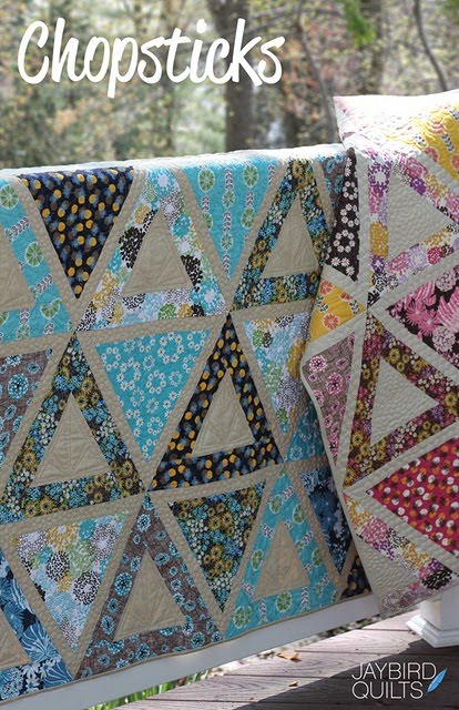
Chopsticks Quilt in 'Just Dandy!' Fabrics by Julie at Jaybird Quilts


Julie Herman over at Jaybird Quilts designed and sewed-up this gorgeous Chopsticks quilt - and used my 'Just Dandy!' fabrics! I just love the modern design of the triangles against the solid color! What a breath of fresh air! Beautiful work Julie!!!


These photo's capture the quilting by Angela Walters just wonderfully!


Please head on over to Jaybird Quilts to read all about how she created this lovely - including her impressive time captures! Both colorways of this Chopsticks quilt are also featured on Robert Kaufman's website.


If you are going to Quilt Market be sure to stop by her booth, #2644, to see Chopsticks in person! Also, this pattern will be available after Quilt Market.

Happy sewing!!!

Sunday, April 24, 2011

Just Dandy! Fabric Give-Away!


Hi Everyone! Just wanted to give you a heads-up about a chance to win some free fabric!!

Head on over to QuiltingDaily.com to enter to win a fat quarter bundle of my 'Just Dandy!' fabric line! Leave a comment there about how you mix and match bold fabrics for your chance to win! A winner will be chosen on Tuesday, April 26th.

A huge thanks to Lindsey Murray of QuiltingDaily.com for interviewing me, and to Robert Kaufman for their generous give-away.

**Please note I am not hosting the give-away on my blog, I'm just letting you know, so please head over to QuiltingDaily.com to enter to win!

Good luck everyone!!

Friday, April 1, 2011

Just Dandy! Fabric Sneak Peak

{Photography by Natalie G Photography}

I just got the pictures back about an hour ago from my Just Dandy! fabric collection photo shoot, and wanted to share a little sneak peak with you! This time I had kiddo's in my photo shoot which was wonderful as they were so joyous and full of energy! The photo above was the last picture of the shoot of me with the girls. We had so much fun!


My Just Dandy! fabric collection is a celebration of modern prints with vintage nostalgia that bring about whimsy and joy.


{Robert Kaufman has just posted my Just Dandy! fabric collection on their website, which is ready for you to see!} **Correction** The collection is not ready to see yet - oops! Thanks for your feedback! I'll keep you posted when it's up and ready!!

What's really exciting about this collection is that it is printed on a lighter weight 100% cotton fabric, which is great for clothing.

I'll be sure to post more pictures from my fun photo shoot on my website soon, and will do another blog post that will be much more in-depth. Please stay tuned!!

And I feel compelled to say "thanks" to everyone out there who has been using my fabrics and sending me pictures! You are such a support and encouragement to me! I hope my new collection is a fun one for you to work with and inspires you to dream up new projects!


Saturday, January 29, 2011

New Valentine Stamps at Impress!

{Card 1: Peacock Feather stamp, Card 2: Sailboat Combo stamp}

Last weekend I stepped into Impress in University Village, and took some pictures of the cards they made using my new Valentine stamps. It was so fun to chat with the girls working there that morning, and to see the different ideas they came up with using my stamps! It was really fun to see how they translated my sailboat stamp, as that was exactly how I pictured it!

{Card 1: Rose Wallpaper + Happy Valentine's Day stamps, Card 2: Folk Flower + Flourish Border stamps,
Card 3: Flourish Medallion stamp}

What's really fun too, is that Impress is giving you more bang for your buck by creating some stamps to be two in one! For example, with the Sailboat Combo stamp, you get both the sailboat illustration AND the words, which are on the side of the stamp. For the Cross My Heart combo, you get the stitched, crossed argyle stamp AND the words 'cross my heart' on the side. Nice treat, huh?

{Card 1: Flourish Medallion + Happy Valentine's Day stamps,
Card 2: Peacock Feather + Happy Valentine's Day stamps}

{Card 1: Flowery Heart with Swirls + Happy Valentine's Day stamps, Card 2: Cross My Heart combo stamps}

For those of you who create your own valentine cards, treat bags, and the like, you can order a variety of fun stamps and supplies online at Impress! Happy stamping, and Happy Valentine's Day!

Sunday, January 2, 2011

Working with Pantone Color Standards - for Fabric

With some new projects that have come my way, and new clients I've been working with, I finally had a huge need to have my own Pantone library so I could communicate color choices across the globe by digital means.

It was one of those moments where I was kinda surprised that I've been doing my own thing for a few years now, and haven't needed to communicate color yet. I've been a professional in the fashion industry for over 10 years, and working with color standards is one of the tools that you just have to have - right up there with having art supplies to create with. So, after doing some online shopping around to find a good price, I finally bit the bullet and purchased a variety of Pantone books that would fit the multiple needs and product categories that I work with.

{Picture of the Pantone Fashion + Home Cotton Selector Books}
I ended up purchasing the Pantone Fashion + Home Cotton Selector for all my fabric/fashion/textile needs because I wanted to be able to remove the colors from the book and place them next to other colors to see how they work together, when choosing colors for my artwork. I would much rather have purchased the Pantone Fasion + Home Cotton Swatch Files books, but that price tag was waaay too high! However, having the ability to work with color chips individually would have been quite dreamy, as this is what I'm used to in my professional environment. I also purchased a variety of Pantone books for paper as well, which include the Solid Chips and the Process Chips.

{Picture of the inside of the Pantone Fashion + Home Cotton Selector Books}

EXPLANATION OF PANTONE & COLOR STANDARDS
For those of you who aren't familiar with color standards or Pantone, let me give you introduction to what it is, and the importance of working with color standards to communicate color accurately. First off, a 'color standard' is a standard language for accurate color communication, from designer to manufacturer to retailer to customer, across a variety of industries. Since color is seen and interpreted differently by individuals, a color standard allows for us all to communicate the same.

There are two major companies out there who produce color standards for the fashion industry. They are Pantone and Scotdic. Pantone is more globally known and used because they also produce color standards for the graphic design industry, web, plastics, etc., and because of this have become the leader in the industry. For this blog post, I'm just going to focus on Pantone.

When using a color standard, and communicating color to a manufacturer, it is important to use the correct type of color standard for the type of product you are working with because the same color will look different when printed on paper vs printed on fabric, etc. This will also allow for the color you are expecting it to look like, to actually be able to be achieved.

CHOOSING THE CORRECT PANTONE STANDARDS
Here are some examples for you regarding working with and choosing the correct Pantone book. Example 1) If you are working with textiles, you would use the Pantone Fashion + Home standards, as the standards are made out of cotton, therefore the colors are achievable on fabric. Example 2) If you are in the graphic design industry, and are printing out a 2 color brochure, you would use the Pantone Solid Chips book, and then choose between the coated and uncoated books, based on the paper your brochure will be printed on. This is because 2 colors are cheaper to print than '4 color process', which uses a mixture of the 4 ink colors 'CMYK' or Cyan, Magenta, Yellow and Black. Example 3) If you are in the graphic design industry and working on a menu that has full color photo's of the entree's as well as multiple colored graphics, then you would use the Pantone CMYK coated or uncoated books for process color, so you could achieve multiple colors using 4 color process printing.

PANTONE'S DIGITAL COLOR LIBRARIES
Also, within digital programs such as Adobe Illustrator & Photoshop, you can open up digital Pantone libraries and work with colors that way, so that the colors used in your document are able to be used as a communication tool to your manufacturer. This is how the graphic design industry works. It's a bit different in the fashion industry, and I won't go into that now, however Pantone did come out with a digital color library for Fashion + Home colors, which I did purchase but haven't used yet. I'm curious to explore this further and see how widely this becomes used in the fashion industry in the future.

Ok, are you still with me? Hopefully this is helpful and not too much information that is causing your head to spin!

WORKFLOW: FROM DESIGN TO PRODUCTION
I also wanted to chat about workflow from design to production, when working with color standards, and when working directly with a manufacturer. Let's say that you design a pattern that is going to be printed on fabric. You pull out your Pantone Fashion + Home color standard book, and begin choosing the colors you want to be used by the manufacturer in your design. You communicate to your manufacturer that the light pink in the artwork is to be Pantone 14-1419 TCX. (Always include the latter part of the number 'TCX' to make sure you and the manuf. are using the same version of Pantone books!).

If the manufacturer doesn't have the Pantone TCX standards on their end, and they only have TC (older version of Pantone colors, before TCX came out), then you have two choices. Communicate colors to them in the TC version, or purchase individual Pantone TCX standards or 'SMART color swatch cards' for each color you want to use in your print and send them to the manufacturer for them to use. If you do this, be sure to cut them in half first - one half for you to keep and the other half you send to your manufacturer, so you have a record of the color.

On a side note - another avenue to all of this is the light source or 'color evaluation tool' - you want to be sure that the light source you are reviewing color in is the same light source that your manufacturer is reviewing color in. This way your communication is very accurate. If you are looking at color under a very yellow bulb from your desk task lamp, and they are looking at color under a fluorescent light source, then the color will look very different, and you will not be communicating about color the same.

Next, the manufacturer will begin creating a strike-off, which is your artwork printed on fabric, and will send off for you to review. When you receive this, you pull out your individual Pantone standards, and compare them to the strike-off under the agreed upon light source, and make your color comments. If the color is off, then you make your color comments to your manufacturer on what they need to do to correct the color. For example, 'reduce red'. Once all of your colors have been commented on, your manufacturer will then make those color adjustments and send you another strike-off. Each strike-off is usually a 2-3 week turn-around. So, if colors aren't coming out as accurate as you would like, and your deadline for production is fast approaching, you will need to either accept a strike-off for what it is or drop it from your line if you think the coloring will not sell.

Once all your colors have been approved, your manufacturer will then begin printing 'bulk' or production yardage of your artwork!

EXPECTATIONS
If you are working with a fabric company, many times they are handling this workflow internally. Sometimes you can opt in to be a part of the approval process, in which some of this would fall onto your plate. If that is the case, then it's very important to be sure to be on top of communicating on the strike-offs ASAP so you can be sure to be a part of hitting the production timelines. It's also important to remember that getting 100% color accuracy is nearly impossible. Color standards do indeed make accuracy and communication not only possible and achievable, but there are so many factors that come into play about why a color is not able to always be achieved.

That's one case when you need to throw off your designer diva hat and throw on your business hat, partner with your fabric company/manufacturer to make the best decisions together to ensure that the product is sell-able. Remember, you are one of the only people who have seen the original artwork & color intention, and will need to look at the fabric from another angle and ask yourself "Is it still sell-able?", "Does it still look good?", "Does it still set with the other prints in the line?". If so, then you have achieved success, not perfection, but success, and that's the best we can hope for!

Ok, this was a loooong post! I know many of you come from a variety of backgrounds and have your hands in all different types of pots, so I'm not sure if this information is interesting or helpful at all, but I thought I would try to bring you some of my professional background and experience and help give you some info, for those of you who this is relevant to. Hope this helps! If you have any questions, let me know, and I will try to answer.

Of course, with all of the above, there are so many other pieces of information that I didn't go into, including monitor & printer calibration, because that would make this post never-ending, and much more of a 'class', which I opted out of : )
LinkWithin

Related Posts with Thumbnails