Monday, May 2, 2011

Chopsticks Quilt in 'Just Dandy!' Fabrics by Julie at Jaybird Quilts


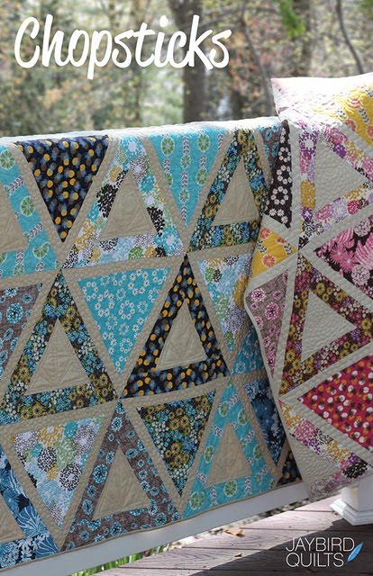
Julie Herman over at Jaybird Quilts designed and sewed-up this gorgeous Chopsticks quilt - and used my 'Just Dandy!' fabrics! I just love the modern design of the triangles against the solid color! What a breath of fresh air! Beautiful work Julie!!!


These photo's capture the quilting by Angela Walters just wonderfully!


Please head on over to Jaybird Quilts to read all about how she created this lovely - including her impressive time captures! Both colorways of this Chopsticks quilt are also featured on Robert Kaufman's website.


If you are going to Quilt Market be sure to stop by her booth, #2644, to see Chopsticks in person! Also, this pattern will be available after Quilt Market.

Happy sewing!!!

Sunday, April 24, 2011

Just Dandy! Fabric Give-Away!


Hi Everyone! Just wanted to give you a heads-up about a chance to win some free fabric!!

Head on over to QuiltingDaily.com to enter to win a fat quarter bundle of my 'Just Dandy!' fabric line! Leave a comment there about how you mix and match bold fabrics for your chance to win! A winner will be chosen on Tuesday, April 26th.

A huge thanks to Lindsey Murray of QuiltingDaily.com for interviewing me, and to Robert Kaufman for their generous give-away.

**Please note I am not hosting the give-away on my blog, I'm just letting you know, so please head over to QuiltingDaily.com to enter to win!

Good luck everyone!!

Friday, April 1, 2011

Just Dandy! Fabric Sneak Peak

{Photography by Natalie G Photography}

I just got the pictures back about an hour ago from my Just Dandy! fabric collection photo shoot, and wanted to share a little sneak peak with you! This time I had kiddo's in my photo shoot which was wonderful as they were so joyous and full of energy! The photo above was the last picture of the shoot of me with the girls. We had so much fun!


My Just Dandy! fabric collection is a celebration of modern prints with vintage nostalgia that bring about whimsy and joy.


{Robert Kaufman has just posted my Just Dandy! fabric collection on their website, which is ready for you to see!} **Correction** The collection is not ready to see yet - oops! Thanks for your feedback! I'll keep you posted when it's up and ready!!

What's really exciting about this collection is that it is printed on a lighter weight 100% cotton fabric, which is great for clothing.

I'll be sure to post more pictures from my fun photo shoot on my website soon, and will do another blog post that will be much more in-depth. Please stay tuned!!

And I feel compelled to say "thanks" to everyone out there who has been using my fabrics and sending me pictures! You are such a support and encouragement to me! I hope my new collection is a fun one for you to work with and inspires you to dream up new projects!


Saturday, January 29, 2011

New Valentine Stamps at Impress!

{Card 1: Peacock Feather stamp, Card 2: Sailboat Combo stamp}

Last weekend I stepped into Impress in University Village, and took some pictures of the cards they made using my new Valentine stamps. It was so fun to chat with the girls working there that morning, and to see the different ideas they came up with using my stamps! It was really fun to see how they translated my sailboat stamp, as that was exactly how I pictured it!

{Card 1: Rose Wallpaper + Happy Valentine's Day stamps, Card 2: Folk Flower + Flourish Border stamps,
Card 3: Flourish Medallion stamp}

What's really fun too, is that Impress is giving you more bang for your buck by creating some stamps to be two in one! For example, with the Sailboat Combo stamp, you get both the sailboat illustration AND the words, which are on the side of the stamp. For the Cross My Heart combo, you get the stitched, crossed argyle stamp AND the words 'cross my heart' on the side. Nice treat, huh?

{Card 1: Flourish Medallion + Happy Valentine's Day stamps,
Card 2: Peacock Feather + Happy Valentine's Day stamps}

{Card 1: Flowery Heart with Swirls + Happy Valentine's Day stamps, Card 2: Cross My Heart combo stamps}

For those of you who create your own valentine cards, treat bags, and the like, you can order a variety of fun stamps and supplies online at Impress! Happy stamping, and Happy Valentine's Day!

Sunday, January 2, 2011

Working with Pantone Color Standards - for Fabric

With some new projects that have come my way, and new clients I've been working with, I finally had a huge need to have my own Pantone library so I could communicate color choices across the globe by digital means.

It was one of those moments where I was kinda surprised that I've been doing my own thing for a few years now, and haven't needed to communicate color yet. I've been a professional in the fashion industry for over 10 years, and working with color standards is one of the tools that you just have to have - right up there with having art supplies to create with. So, after doing some online shopping around to find a good price, I finally bit the bullet and purchased a variety of Pantone books that would fit the multiple needs and product categories that I work with.

{Picture of the Pantone Fashion + Home Cotton Selector Books}
I ended up purchasing the Pantone Fashion + Home Cotton Selector for all my fabric/fashion/textile needs because I wanted to be able to remove the colors from the book and place them next to other colors to see how they work together, when choosing colors for my artwork. I would much rather have purchased the Pantone Fasion + Home Cotton Swatch Files books, but that price tag was waaay too high! However, having the ability to work with color chips individually would have been quite dreamy, as this is what I'm used to in my professional environment. I also purchased a variety of Pantone books for paper as well, which include the Solid Chips and the Process Chips.

{Picture of the inside of the Pantone Fashion + Home Cotton Selector Books}

EXPLANATION OF PANTONE & COLOR STANDARDS
For those of you who aren't familiar with color standards or Pantone, let me give you introduction to what it is, and the importance of working with color standards to communicate color accurately. First off, a 'color standard' is a standard language for accurate color communication, from designer to manufacturer to retailer to customer, across a variety of industries. Since color is seen and interpreted differently by individuals, a color standard allows for us all to communicate the same.

There are two major companies out there who produce color standards for the fashion industry. They are Pantone and Scotdic. Pantone is more globally known and used because they also produce color standards for the graphic design industry, web, plastics, etc., and because of this have become the leader in the industry. For this blog post, I'm just going to focus on Pantone.

When using a color standard, and communicating color to a manufacturer, it is important to use the correct type of color standard for the type of product you are working with because the same color will look different when printed on paper vs printed on fabric, etc. This will also allow for the color you are expecting it to look like, to actually be able to be achieved.

CHOOSING THE CORRECT PANTONE STANDARDS
Here are some examples for you regarding working with and choosing the correct Pantone book. Example 1) If you are working with textiles, you would use the Pantone Fashion + Home standards, as the standards are made out of cotton, therefore the colors are achievable on fabric. Example 2) If you are in the graphic design industry, and are printing out a 2 color brochure, you would use the Pantone Solid Chips book, and then choose between the coated and uncoated books, based on the paper your brochure will be printed on. This is because 2 colors are cheaper to print than '4 color process', which uses a mixture of the 4 ink colors 'CMYK' or Cyan, Magenta, Yellow and Black. Example 3) If you are in the graphic design industry and working on a menu that has full color photo's of the entree's as well as multiple colored graphics, then you would use the Pantone CMYK coated or uncoated books for process color, so you could achieve multiple colors using 4 color process printing.

PANTONE'S DIGITAL COLOR LIBRARIES
Also, within digital programs such as Adobe Illustrator & Photoshop, you can open up digital Pantone libraries and work with colors that way, so that the colors used in your document are able to be used as a communication tool to your manufacturer. This is how the graphic design industry works. It's a bit different in the fashion industry, and I won't go into that now, however Pantone did come out with a digital color library for Fashion + Home colors, which I did purchase but haven't used yet. I'm curious to explore this further and see how widely this becomes used in the fashion industry in the future.

Ok, are you still with me? Hopefully this is helpful and not too much information that is causing your head to spin!

WORKFLOW: FROM DESIGN TO PRODUCTION
I also wanted to chat about workflow from design to production, when working with color standards, and when working directly with a manufacturer. Let's say that you design a pattern that is going to be printed on fabric. You pull out your Pantone Fashion + Home color standard book, and begin choosing the colors you want to be used by the manufacturer in your design. You communicate to your manufacturer that the light pink in the artwork is to be Pantone 14-1419 TCX. (Always include the latter part of the number 'TCX' to make sure you and the manuf. are using the same version of Pantone books!).

If the manufacturer doesn't have the Pantone TCX standards on their end, and they only have TC (older version of Pantone colors, before TCX came out), then you have two choices. Communicate colors to them in the TC version, or purchase individual Pantone TCX standards or 'SMART color swatch cards' for each color you want to use in your print and send them to the manufacturer for them to use. If you do this, be sure to cut them in half first - one half for you to keep and the other half you send to your manufacturer, so you have a record of the color.

On a side note - another avenue to all of this is the light source or 'color evaluation tool' - you want to be sure that the light source you are reviewing color in is the same light source that your manufacturer is reviewing color in. This way your communication is very accurate. If you are looking at color under a very yellow bulb from your desk task lamp, and they are looking at color under a fluorescent light source, then the color will look very different, and you will not be communicating about color the same.

Next, the manufacturer will begin creating a strike-off, which is your artwork printed on fabric, and will send off for you to review. When you receive this, you pull out your individual Pantone standards, and compare them to the strike-off under the agreed upon light source, and make your color comments. If the color is off, then you make your color comments to your manufacturer on what they need to do to correct the color. For example, 'reduce red'. Once all of your colors have been commented on, your manufacturer will then make those color adjustments and send you another strike-off. Each strike-off is usually a 2-3 week turn-around. So, if colors aren't coming out as accurate as you would like, and your deadline for production is fast approaching, you will need to either accept a strike-off for what it is or drop it from your line if you think the coloring will not sell.

Once all your colors have been approved, your manufacturer will then begin printing 'bulk' or production yardage of your artwork!

EXPECTATIONS
If you are working with a fabric company, many times they are handling this workflow internally. Sometimes you can opt in to be a part of the approval process, in which some of this would fall onto your plate. If that is the case, then it's very important to be sure to be on top of communicating on the strike-offs ASAP so you can be sure to be a part of hitting the production timelines. It's also important to remember that getting 100% color accuracy is nearly impossible. Color standards do indeed make accuracy and communication not only possible and achievable, but there are so many factors that come into play about why a color is not able to always be achieved.

That's one case when you need to throw off your designer diva hat and throw on your business hat, partner with your fabric company/manufacturer to make the best decisions together to ensure that the product is sell-able. Remember, you are one of the only people who have seen the original artwork & color intention, and will need to look at the fabric from another angle and ask yourself "Is it still sell-able?", "Does it still look good?", "Does it still set with the other prints in the line?". If so, then you have achieved success, not perfection, but success, and that's the best we can hope for!

Ok, this was a loooong post! I know many of you come from a variety of backgrounds and have your hands in all different types of pots, so I'm not sure if this information is interesting or helpful at all, but I thought I would try to bring you some of my professional background and experience and help give you some info, for those of you who this is relevant to. Hope this helps! If you have any questions, let me know, and I will try to answer.

Of course, with all of the above, there are so many other pieces of information that I didn't go into, including monitor & printer calibration, because that would make this post never-ending, and much more of a 'class', which I opted out of : )
Thursday, December 23, 2010

Happy Holidays Everyone!


Here we are at the end of another year. I don't know about you, but they keep going faster and faster, don't they? This year has sure been full of fun people, community, and great new clients. Thanks to all of you who have swung in, commented on my blog posts, and contacted me to let me to let me know what you've been up to with my fabrics and stamps - your support fuels me to continue putting one foot in front of the other and press on with my dreams.

I have been quite a stranger as of late - so sorry about that! I've been busy working and working away, which usually mean new things are happening, but not able to be chatted about yet. I'll be able to share some exciting new projects with you in the coming year. Stay tuned!

I hope all of you have a wonderful Christmas and a happy New Year! May 2011 bring many wonderful things your way!!

Saturday, November 27, 2010

Inspiration: Pinterest

{Photograph by Steven Meisel for Vogue, from KelleyMooreCreativeMedia.Blogspot.com}

I've been subtly addicted to the website Pinterest as of late - well, me and some of my friends that is! What is Pinterest you may ask? It's a social catalog service. Think of it as a virtual pinboard — a place where you can post collections of things you love, and "follow" collections created by people with great taste.

{Image from Selina Lake, Stylist}

So, as I've been researching online, or just browsing for fun, I "pin" an image that I like to one of my "boards". It's been a great way to visually catalog and organize the things that inspire me, that I want to capture. Also, the source website link is attached to each image, to take you on a web browsing extravaganza! So far, I've got boards called Books Worth Reading, For the Home, Pattern Savvy, Letterpress, etc., and the list keeps growing! I've added a link on my blog, on the right hand side that says "Follow my pins on Pinterest"

{Chair from Anthropologie}

Swing on over to my Pinterest boards, when you're looking for some eye candy! There's a whole network of other people's boards there too for loads of inspiration!

Sunday, October 31, 2010

Around Town: Seattle

This Friday, lucky me, my friend Tobe of Two Tall Blondes came to Seattle. I took the day off of work to show her around the non-touristy parts of town and to do some fun boutique shopping. We spent most of our time in Ballard and Fremont. I snapped some pic's of our adventure, and thought I'd share some of my favorites with you. If you're ever in town, in addition to going to the Space Needle and Pikes Place Market, I highly suggest checking out these two neighborhoods.

Our first stop was for breakfast at the Wild Mountain Cafe in Ballard. Their breakfast specialty is Eggs Benedict, so I braved them for the first time in my life - and they were de-lish! It's cozy atmosphere is thanks to the home it occupies.


Next, we headed over to Ballard Ave to hit-up a string of cute shops around there. My all time favorite is Camelion Design, which has such amazing home decor items that are right up my alley. Natural textures meets modern design = LOVE! If only I could just "copy" and "paste" these looks and items directly into my home!


Lucca has a distinctive European flair to it, and carries such an eclectic mix of unique treasures that they mix with vintage for a dark French flea market atmosphere.


Venue is a work studio and boutique, which is such a clever shop idea! The boutique carries product from over 40 different local artists. There are 8 artist studio's in the back, and much of what those artist's create, shows up on the boutique's selling floor. At times, you can even get a glimpse of the artists hard at work.


Romanza kept us busy for a while, as we couldn't keep our hands off everything! So many delicious smelling candles and fragrances in gorgeous packaging! The pictures I have below is from the baby section. Be-U-TI-ful!


Now, two of my favorite coffee shops in Ballard are Verite Coffee (which sells the TASTY cupcake concoctions of Cupcake Royale!) and the organic coffee house Caffe Fiore. Since it was a bit too early for a cupcake, we opted for Caffe Fiore, which makes a mean and spicy chai tea latte!


We then continued our adventure in Fremont, stopping at the sustainable sandwich shop, Homegrown, for a DELICIOUS lunch. I love their logo and the chalkboard menu lined wall!


Burnt Sugar has long been one of my favorite's, and not just because it has the BEST name ever and a rocket ship mounted to the front of the shop. It carries a great mixture of handbags, jewelry, shoes, accessories and beauty products, all under a painted pink ceiling. Dreamy!


Essenza is such a beautiful and charming shop! Chocked-full of stunning jewelry, soaps, fragrances, beauty products, baby items, home decor and the like! I was ogling over the owls I have snapped a picture of - may just need to go back for those cuties!


And there you have it! Hope you've enjoyed getting a little sneak peak of some neighborhoods and a few fun shops in Seattle from our weekend trip! I keep adding Seattle websites to my Delicious bookmarks, so feel free to check them out if you're curious. If you've been to Seattle, what's your favorite shop or area??

Tuesday, October 12, 2010

I Spy: Glam Garden!


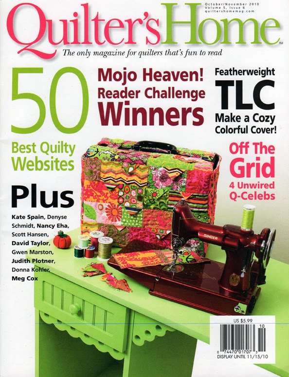
{Cover of Quilters Home Magazine | Oct/Nov 2010 Issue}

This weekend, I visited one of our favorite hang-out spots - Barnes & Noble to peruse magazines and books while sipping a Chai tea latte. I started in the women's interest section, then the home magazines, the computer section, and then the sewing and crafting section - piling on magazines at each stop. As I was in the sewing section, pulling out the Quilters Home magazine, I spotted something that looked a bit familiar. Looking more closely, i-spied some of my Glam Garden fabric being used for a featherweight cozy cover on the cover of the magazine!!! The COVER? Seriously? I teared up on the spot, rushed to my husband and shook the magazine at him (gently) with my one free hand. His huge smile and my teared up eyes made for a happy moment.

Teri Coffman? You made my day, week, month! {Thanks for using Glam Garden! Gush!}


As you could probably guess from my exuberant thanks, Teri Coffman is the designer behind this Fab Featherweight cozy. Check out her blog to read up on her story regarding this cozy cover, and many more fabulous things and sewing adventures on her blog. There's a variety of fabric prints mixed in with Glam Garden {in case you are having trouble spotting}, but that does not for one bit change my excitement!

Just thought I'd share with you my happy moment {blush}.

Sunday, September 19, 2010

Glam Garden Discoveries: Part 2

{Photo's courtesy of Danielle Bryson Photography for Loblolly Lane}

I wanted to share with you some of the beautiful projects that have come my way! First off, thanks to those who have answered my call to send me pics of projects you have made using my Glam Garden fabrics! It's so delightful to see the beauty you are creating, and to be able to share it with people. I hope you all enjoy seeing what these peeps have been up to!

{Photo's courtesy of Danielle Bryson Photography for Loblolly Lane}

Eunice Carter over at Loblolly Lane sent me these fab pics! Loblolly Lane has made a variety of beautiful dresses, skirts and tops for women and girls out of Glam Garden prints! These beauties are for sale and you can head over to their shop to check them out! {Thanks Loblolly Lane for using Glam Garden in so many of your products!!}

{Photo's courtesy of Danielle Bryson Photography for Loblolly Lane}

{Loblolly Lane}

{The Sewing Blonde}

Check out this amazing dress from The Sewing Blonde! Fantastically beautiful! She created this fab dress using the Analise pattern from Portabellopixie. Her daughter wore this number for her first day of school - talk about a grand dress for a grand occasion! Isn't it striking? You can read all about her sewing adventure of creating this dress on her blog here.

{The Sewing Blonde}
The photo of the back of this dress makes me swoon! Such beautiful and hard work went into this beauty!

{The Sewing Blonde}

She also created this cute hair accessory out of one of the flowers from Glam Garden as well. Great idea, don't you think?

{The Thrifty Quilter}

Meghan over at the Thrifty Quilter blog, made this absolutely STUNNING hexagon quilt out of Glam Garden! I love how she mixed in the bright solids with the prints!! You can tell a lot of hard work and love went into this project. SO fun!

{The Thrifty Quilter}

{Sophie & Lili}

Jennifer Vallez over at Sophie & Lili sent me this photo of the absolutely fabulous dolls they make - and this one has Glam Garden decorating the back! LOVE! Aren't these dolls cute?

{The Organized Shopper}

This Original Hands-free List Maker / Coupon Organizer is made by The Organized Shopper who makes these great designer coupon organizers and sells them on Etsy. I heart organization, you?? What a great idea! I love the labeled tabs inside.

{The Organized Shopper}


Whew! What a round-up of beautiful things! Thanks so much to everyone who sent me pictures of your fabulous projects, and thank you so much for using Glam Garden! I really appreciate it!

LinkWithin

Related Posts with Thumbnails